Archive
SSRS–Creating the Stephen Few Data Visualization
In my last blog post, I described an approach where the DateTool dimension of Marco Russo was extended to include an Aggregate Month attribute. When referenced in a query in combination with a member of the Aggregation attribute in an MDX query, the Aggregate Month attribute produces the time periods that compose that aggregation. Enhancing your SSAS multidimensional cube in this manner provides functionality that is similar to the Time Intelligence functionality available in PerformancePoint Services, sort of a way of providing dynamic date specific named sets. I feel they’re advantageous for several reasons but I’m a bit on the biased side. For one thing, these “dynamic time-based sets” such as the last twelve months prior to the selected month will be available in any front-end and not just PPS. And as referenced in this SSAS forum post, this approach was successfully used to provide a “Date Sets Alternative” in Tableau.
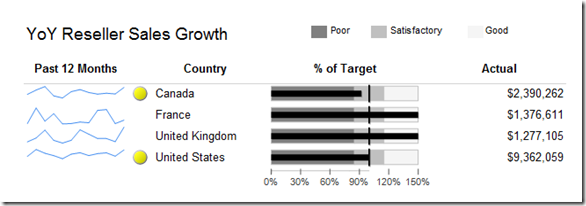
The original purpose of the enhancement was to facilitate creation of the Stephen Few sales performance dashboard data visualization from Information Dashboard Design. The goal was to make creation of the visualization simple enough that it could be created in ReportBuilder. The end result using the modified Adventure Works source will end up looking something like the following.
In the visualization above, the Year-Over-Year YTD Reseller Sales Growth is shown by Country. For this demonstration, a targeted YTD YoY growth of 15% is expected. Any YoY growth rate that is 0.85 or below is considered poor while any value between 85% and 115% was considered Satisfactory as indicated by the linear ranges of the bullet graph shown in the fourth column of the visualization.
To create this visualization, the following steps need to be executed.
- Create a single dataset to source all elements,
- Create a Tablix control bound to the dataset with a Grouping on Country,
- Add Sparkline, Bullet Graph, and Indicator controls, and
- Add the legend and scale adornments to the visualization.
Creating the Dataset
Having made the modifications to the Adventure Works cube described in the previous blog post, creating a single dataset to source all data visualization components is simplified greatly. For each Country shown in the diagram above, the dataset produced will need to include the following data elements.
- Reseller Sales Amount by month for the Past 12 Months,
- YTD Reseller Sales (horizontal bar in bullet graph above, fifth column, and Indicator value),
- Prior Year YTD Sales to calculate target value (vertical line in bullet graph above), and
- Columns that represent the boundary values for the linear ranges defining the bullet graph.
The challenge in creating such a dataset is that the date context and date aggregation are at different grains within the same query. To create the dataset, first define a data source to the Adventure Works cube. Next, create a new dataset and in the Query Designer window, drag the [Date].[Month] and [Date Utility].[Aggregation] attribute hierarchies to the Filter Pane. Check the Parameters checkbox for the [Date].[Month] attribute so that consumers can dynamically change the filter context and specify [Last 12 Months] as the filter for the [Date Utility].[Aggregation] filter. [I also added a Filter to limit Countries to only Canada, France, United Kingdom, and the United States only because the Adventure Works cube is pretty sparse] The initial dataset was defined by dragging the [Geography].[Country], [Date Utility].[Aggregate Month], and the[Measures].[Reseller Sales Amount] to the Data Pane. Now you have a query produces the Reseller Sales Amount by Country for the Last 12 Months from whatever selected month the User selects to run the report. How easy was that?
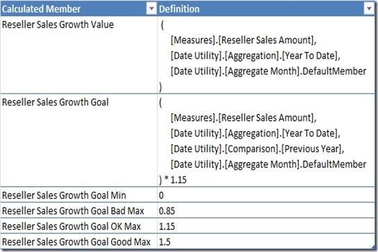
To complete the query, the Actual, Goal, and boundary values for each of the linear ranges need to be added to the query. Since the Aggregation context differs from the [Last 12 Months] created as a filter, calculated members will be created to overwrite this context. These calculated members are created in the Calculated Members Pane of the designer and have the names and definitions as given in the following table.
Two additional points should be specified that were left out of the Definition column above. As the Value and Goal measures overwrite the current context of the [Date Utility].[Aggregate Month] attribute, these metrics were wrapped in an IIf function so that every member of the [Date Utility].[Aggregate Month] hierarchy was returned. (i.e. IIf(([Measures].[Reseller Sales Amount], [Date Utility].[Aggregate Month].CurrentMember) = 0, NULL, …..) ) Additionally, since the constants as defined will also return every member of the [Date Utility].[Aggregate Month] hierarchy, these constants were multiplied by [Measures].[Reseller Sales Growth Value]/[Measures].[Reseller Sales Growth Value] so that NULLs were returned for months outside of the Last 12 Months range.
Defining the Tablix Control
Adding the Tablix control is the simplest step in the process. Insert a Table control to the report and set the DatasetName property equal to the Dataset created above. Add two additional columns to the table, create a grouping on Country (and delete the row matrix column created without deleting the group), and delete the Details section from the report. Bind the third column to the Country field and define the fifth column to the Max([Reseller Sales Growth Value]). The last little bit of formatting involved setting the BorderStyle to None for all textboxes except for the bottom border of the column headers. That’s it. The framework for the data visualization is now defined and now the more difficult process of defining the data visualizations begins.
Creating the Visualizations
Insert a Sparkline in the first column of the table. Set the Category Groups to Aggregate Month and the Values to the Reseller Sales Amount. That’s it for that.
Defining the Indicator is not much more difficult. The only thing to watch out for is that the expressions for Values and States should use the Max, Min, or Avg aggregations of Reseller Sales Growth Value and Reseller Sales Growth Goal rather than the default value of Sum. Once completed, four out of five columns are now there. The only one left is the bullet graph.
Rather than detail how the bullet graph was formatted, most of the steps that I followed are described in detail in Tim Kent’s post from 2009 without all the jiggery-pokery that was required in previous versions of SSRS. The linear ranges were defined using the Max value of the dataset columns explicitly created for that purpose. The linear ranges were defined to have a start and end width of 75% while the solid fill colors for the Poor, Satisfactory, and Good ranges were defined to be Gray, Silver, and WhiteSmoke respectively, providing the contrast necessary to distinguish in the figure shown previously. That’s it for the visualizations.
Completing the Data Visualization
To complete the process, legends and scales were added to the Tablix. The legend is the simpler task. The rightmost report header columns were merged and a rectangle control was inserted to allow for free-entry into that cell. Three additional small rectangles and three textboxes were added to identify the Poor, Satisfactory, and Good linear ranges. The BackGroundColor property for each of the rectangles was set to the appropriate color as identified above.
The scale was added by inserting a Country group summary row and adding another bullet graph to the fourth column of that row. The width properties for all linear ranges and pointers was set to zero so that these elements of the Gauge control were effectively not displayed. Trial and error techniques were used to determine the optimal Scale properties. The most likely change that will be necessary is to increase the Font size of the Scale to an absurdly large amount. For the visualization shown above, the Font size ended up being 48pt.
The completed report is available on my Skydrive account.
Summary
The greatest challenge in replicating the Stephen Few data visualization with SSRS is the creation of a single dataset in which all visualizations can be sourced. By enhancing the DateTool dimension of Marco Russo to include an additional Aggregate Month attribute, the enhanced Date Utility dimension discussed in the previous blog post greatly simplifies the necessary steps.

